Research
- User interviews
- Prototyping
- Usability testing
Strategy
- Brand narrative
- Positioning
- Tone of voice
- Naming support
Design & Production
- Brand identity
- UX & UI design
- Design system
- Motion
Platforms
- iOS
- Android
Year
- 2025
Challenge
Rivals turns everyday life into a running scoreboard between friends. Steps, streaks, dares, bragging rights. The brief was to make competition feel like your group chat, not a fitness dashboard.
Identity and app, built together. A loud red wordmark that behaves like a sports franchise, and a challenge loop fast enough to answer trash talk the moment it happens.


Strategy
Competition should feel like banter, not warfare, so every mechanic is tuned to the group-chat energy the app grew out of.
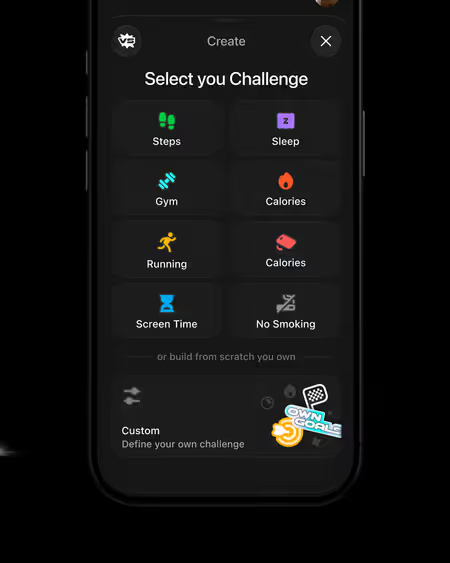
Challenges are the atom. Pick a friend and pick the stakes, whether that is steps, distance or a custom dare, and the whole thing runs in a chat thread where progress posts itself and the losing side hears about it.
Finding your rivals takes one tap on your contacts. Keeping them is the rank ladder, where every finished challenge moves you up, or embarrassingly down.



Outcome
A brand that talks trash, kindly. The voice does the heavy lifting. "Free was the warm-up" sells PRO, and "It’s quit now, but not for long" restarts a lapsed streak.
Every push, empty state and result screen sounds like the friend you cannot wait to beat, which keeps the trash talk warm instead of mean.
The franchise look of red, black and that wordmark scales from the app icon to the title sequence. Loud enough for game night, tight enough for the App Store.


